Friday, 25 September 2015

Preliminary Task Evaluation

What I have learned from completing this task:

From completing the preliminary task I have learned how the typical conventions are used on a magazine cover and how the conventions allow the theme (house style) to be used throughout the magazine. I understand how this is effective and allows the reader to easily distinguish the genre of the magazine. It also makes the product appeal to be more professional.

I have also learned how to manipulate images through Photoshop and add text to produce a finished product. My understanding of Photoshop has been developed and I have learned how to erase and adapt parts of an image to make it more appealing.  I have also attempted to change the background of an image through removing existing parts.

Through the process of creating my college magazine, I have been aware of working towards a deadline and managing my time accordingly to ensure my work was complete on time and to the best of my ability. This at times has been a challenge but is something I have learned to adapt myself to manage and best enable myself the opportunity to make my work of a higher level.

Technology:

I have used Photoshop to allow me to create the magazine cover and contents page, which is software I am unfamiliar with and have had no previous experience with. In Photoshop I have acquired many new skills and been able to use the facilities it offers to create a finished product that follows the conventions of existing magazine covers and contents pages.

I have also had to learn how to operate a camera and upload the photographs onto the computer, which I have not done previously. To do this I had to use a SD card to store my images in and a card reader to transfer the images across to the computer.

Another part of technology I had to learn to use efficiently is blogger to create my blog. I have not previously used a blog so the software was unfamiliar, but I learned to use it quickly.


What conventions I used:

The conventions featured on my magazine cover and contents page included a masthead, feature stories, main feature story, main image, a plug, page numbers, date and issue number, price, and a skyline. My magazine cover follows the conventions used by other existing products in order to allow it to resemble a magazine and make it easier for a reader to understand.

All the conventions I have used are typical of other magazines, although, I have missed out a number of conventions such as footer as I struggled with the spacing of my features and was wary not to overcrowd my cover, as this would make the product less appealing to the target audience. Equally, I didn’t need to add to much detail to the cover as the skyline I have used adds a lot of content in a small amount of space, which is also what a footer does so I felt it would be unnecessary to include both features on my product.

Changes I would make:

If I were to do the task again, I would manage my time differently to allow myself more time on Photoshop to improve and adapt my cover and contents page to be of a higher standard in order to represent a more typical college magazine and fit better within the genre. This would also allow me the opportunity to do more research into the features of a magazine and try to include more in my product.

I would change the font style and size and affect in order to make the font stand out more and be more apparent to the reader; this would also allow my product to resemble a typical magazine, as this is a common convention. I would do this by editing the text to make it have a shadowing affect so it stood out from the main feature image and would be easier to read.


I would also conduct more research into the layout and conventions of other college magazines to find out more on their language, ideology, institutions, audiences and representations. I would do this to allow me to carry over the ideas of existing products into my own product.

Finnished Product


Evaluation


My media product uses forms of conventions as the cover is clearly recognisable as a college magazine. It uses a masthead, a main image, a plug, feature stories, main feature story, a barcode, a date and issue n umber, and footer. The conventions of a magazine cover are typical of a real media product.

My product is clearly representative of a college student’s magazine aimed at college students, or anyone studying A levels or AS levels. The audience can be either male or female. It represents a student studying to improve their future and achieve their ambitions.

My product could be distributed in a college environment, or in local shops in towns where many college students live in order to sell to the target audience.

The audience of my product is male and female teenagers studying A/AS levels, typically between the ages of 16 and 19.

To attract and address my audience, I made my magazine cover colourful and eye-catching, it is also displaying images of students studying and enjoying themselves in a college environment. Furthermore, my magazines main headlines are topics that are associated with what students would enjoy to read, and the title is explicit of the type of magazine to allow the audience to recognize the category of the product immidiently.

I have learnt how to use Photoshop to manipulate an image and create a magazine cover and contents page through the process of making the product. I have also deepened my knowledge of working with a camera and using different framings.

Friday, 18 September 2015

Mies-En-Scene and Location Ideas

Mise-en-scène includes the setting, lighting,costumes, and props.

Setting/Location Ideas
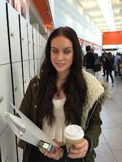
In my magazine cover, i plan to use a setting which is typical of a college enviroment in order to allow the reader to easily identify the product to be appropriate to their interests.
The setting could be in the college canteen, in the college libary, by the lockers or inside a classroom. this would allow the reader to recognise the setting and assosiate the magazine with college.

Character/Costume
The person appearing in the cover could be a student from college wearing typical casual clothes to inform the reader they are a typical student.

Props
The props could be a pile of books, or a college folder to imply to the reader that the magazine is about college life, and it apeals to students in college.

Lighting
The lighting will be bright enough so that the image is clear to the reader.

Final Image 
The image on the cover will be framed as to clearly display a college student enjoying themselves in the college. This will then have the connotation that college is enjoyable and students that attend are happy in their studies.

Camera Framings


Feature Story Ideas


  1. Technology: dangers of phones, Facebook, social media etc. 
  2. Relationships: are teens talking to their parents more or less these days?  Why?  Are most teenagers’ happy/satisfied with their friendships/relationships at school?  Why?
  3. Body image: I know this one is borderline overdone, but the fact is, it is always relevant to teenagers.
  4. Stress: are exam requirements creating more stress than good?  What makes teenage lives so stressful? 
  5. Healthy ways of coping with teenage stress...
  6. Fashion: What to buy to be look good on campus, what are the latest trends, where to get the best deals etc.
  7. Food: What foods are good/bad, what to avoid, the best Starbucks etc.
  8. Revision: How to revise to make it affective, techniques and tips.
  9. What to do after college- an article on an ex student.
  10. Advice column, from other students/teachers.
  11. Transport: Buses, new cars, cheaper ways to travel and most eco-friend ways.
  12. Facts on colleges, interesting quotes about education.

Thursday, 17 September 2015

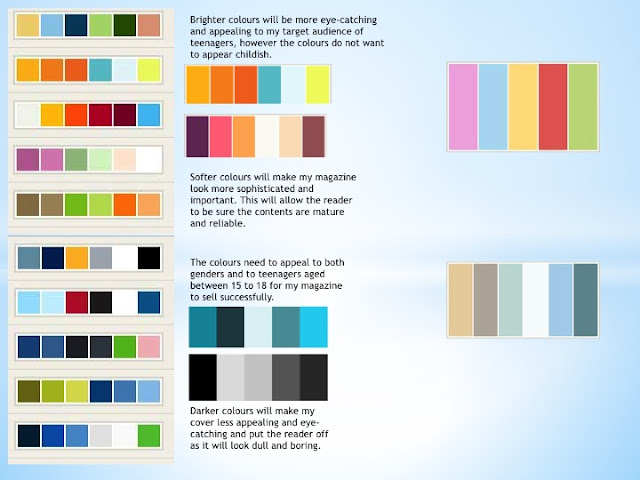
Colour Schemes


My selected colour scheme.

Name Ideas

  1. Class
  2. Pupil
  3. The Student
  4. Wyke Hype
  5. College Crave
  6. Studies
  7. Nerd Herd
  8. College Life
  9. Teenage page
  10. Focus
  11. 6th Form
  12. 6th Chapter
  13. Love Learning
  14. Corses
  15. A Team
  16. Ace You’re a Levels
  17. Independent
  18. Student Voice
  19. Ambition
  20. Achieve
  21. Target