Monday, 29 February 2016

Evaluation Question One

In what ways does your media product use, develop or challenge forms and conventions of real media products?


My media product uses typical conventions and forms of existing media products. In this way it is a recognisable music magazine and will appeal to the target audience.
On the cover, my product uses a clear masthead that communicates the genre of the music it represents, it includes feature stories, and a main feature story which uses a larger font and links to the main feature image. The house style is created on the cover with the colour scheme of gold, black, grey and white, which are all colours associated with the R&B music genre. There is a plug used on my cover which is a feature present on many existing products, my plug links to the main feature story to engage the reader, a technique I learned through my research into existing music magazines. I have also included a barcode, date, issue number and price for the audience’s convenience on the cover; this is a feature that many existing magazines employ as it is a convention that is useful and convenient to the audience. A tag line introduces the reader to the style of my product and a skyline allows them to understand extra information about the product in a small space.


On the double page spread of my product, I continue the house style of the product through the use of the colours gold, black, grey, and white. The masthead is also continued across to create continuity for the audience, which is a convention present in existing products available. The tag line has also been continued across, although it now takes on a different colour than originally on the cover to make it stand out more on the background of this page, which I understand is unusual of a magazine but in this way my product challenges the conventions in order to make the text clearer for the reader. By using sub heading I was able to divide up my feature stories in a neat structure making it easier for my audience to search the contents. This layout created a conventional structure, which I had previously struggled with during the creation of my product. The main feature image is large and engaging, it shows how the subject stands out in the R&B music industry by the way she stands out on the page, using an outer glow and shadow affect. The plug is continued over onto this page from the cover although it is now on a black splash across the lower right hand side of the page which is conventional to include on a contents page and is eye-catching for the audience, as well as following the house-style of my product in the way that it is presented. The page numbers and titles of the stories are in the same font to create continuity and make it clearer for the reader; also the headings have little introductions to introduce the reader to the feature story immidiently, which I have learned is a convention that many existing products use.

 
My double page spread has changed drastically through the development process to follow more of the conventions used in existing music magazines. In this way it is a more recognisable double page spread that communicates the intentions to the audience in a way that is engaging and appealing.  The colour scheme is continued throughout my product and into my double page spread, creating a house style. The font I had previously used to communicate this feature story on the cover and the contents page I have also used on the double page spread to enable the reader to link the story to the cover and contents page and create a connection between the three appearances of the feature story. This is a feature used in many successful products that I have researched into as it creates continuity and the audience can engage with it. I have used an outer glow on the article to make it stand out from the background in order for the reader to be able to read it, and the drop cap is a different colour to make the start of the article clear which is a convention throughout many magazine articles. 
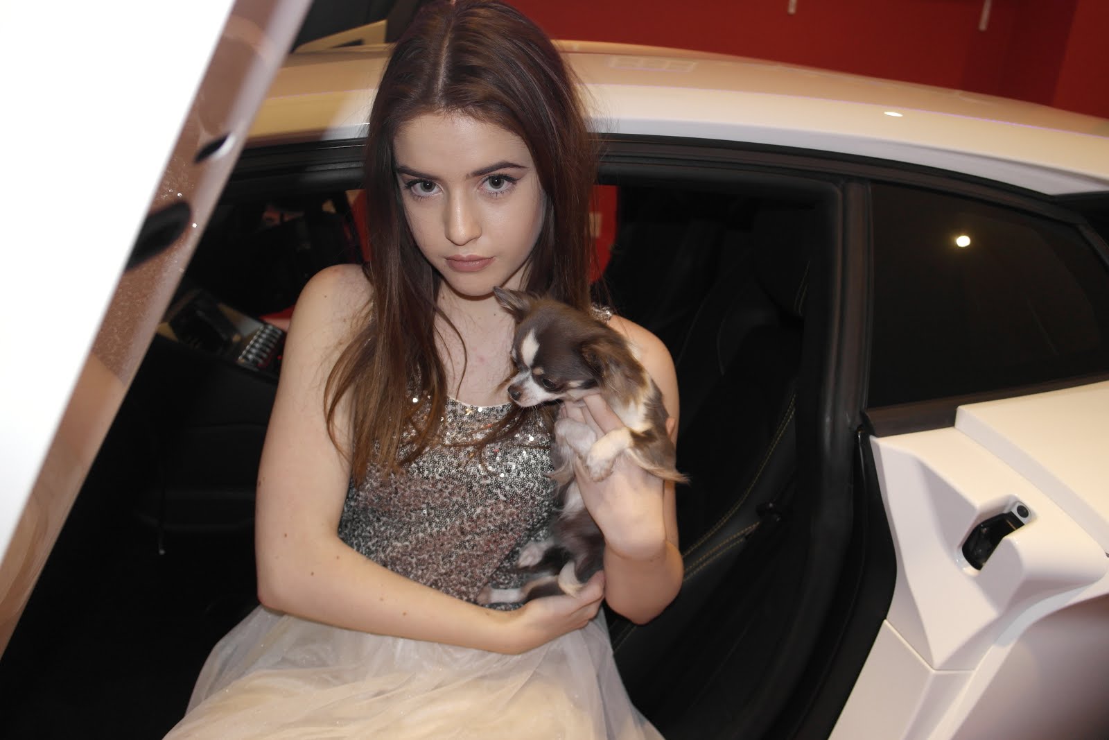
the Main image is a little unusual and perhaps challenges conventions of existing music magazines as the subject is not shown to be with any musical related objects, but she is however shown in a glitzy gold dress which is my colour scheme, and she is in a n expensive car which is associated with the money that fame brings, re-enforcing the message that she is successful and has done well within the industry. She is not using a direct mode of address and the image represents the kind of photograph a paparazzi member would take, which are the type of images commonly used within music magazines so I had chosen to go for this strategy to communicate how successful the subject had become and create verisimilitude for the audience. I have also included the name of the subject in a colour that is associated with the stage name I have created for her, again creating a link for the audience and making the story more believable and realistic. There is little gold on the page, what is gold really stands out because of this for instance the page number, the drop cap, and the quotation, all the gold links to the subject as she is in gold herself. This is a feature I found through my research into existing music magazines that works well on double page spreads to make some parts more eye-catching for the reader. I have also included a subheading before the article through my re-drafting process as this was a feature I noticed was conventional in existing products.

Evaluation questions


Evaluation questions
1)   In what ways does your media product use, develop or challenge forms and conventions of real media products?

2)   How does your media product represent particular social groups?

3)   What kind of media institution might distribute your media product and why?

4)   Who would be the audience for your media product?


5)   How did you attract/address your audience?

6)   What have you learnt about technologies from the process of constructing this product?

7)   Looking back at your preliminary task, what do you feel you have learnt in the progression from it to the full product?

Tuesday, 19 January 2016

Doble Page Spread Development/Progress

 
FINAL DOUBLE PAGE SPREAD

INSPIRATION / RESEARCH
I like the simplisity of this double page spread, the size of the image and the different fonts that are used that all come together to create a powerful double page spread. I plan to do something similar with my double page spread but use my house colours as this is a convention I would like to follow.

PROCESS
 First, I selected an image of Amanda in moton and cropped out all the background and anything I did'nt want in the image. By changing the ocupacity of the image I made her slightly less visable as I plan to place my article over the top of her and need it to be visable.
 By duplicating the image, I made the second slightly smaller and less viable.
 Again, I duplicated the image making the third even smaller and less viable. This creates the illusion she is moving, growing and getting bigger which is what the article is about and her main feature story so this use of imagry re-enforces the message of her rising to the top of the charts on a visual aspect.
 This is how I was able to manipulate the images to change the ocupacity and adapt the coulours to enhance the gold and black to match my colour scheme.
 By adding a larger imge, this becomes the pages main image, I adapted the colour of her eyes and lips and changed the headphones from siver to gold to match the colour scheme. The angle of the image implies she is rising to power and looking up to the future. Her eyes now appear more golden to match the colour scheme and show how she sees golden opertunities.
I airbrushed and bklended her face to appear more flawless and even. I made her lips stand out more and enhanced the shadow on her face to continue the mood it created on the cover.


I have layered up Amanda in the left which will fall below the article to re-enforce the main feature story of how she rose to the top of the R&B music industry. I adapted the ocupacity to make the text for the article clearer on top of these images. In the main image I have changed the colour of Amanda's lips, teeth and eyes to make her more appealing and the gold tone fits in with my house style. Also I have changed her headphones from white and silver to white and gold to match my theme.


My first draft of my double page spread. To imoprove I could change the font of the title to match the one used on the cover so it continues the theme the reader associates with the main feature story. Equally, I could adapt the other fonts which I have used and make them more conventional, and reposition the text at the bottom of the page inside the main article.


PROCESS VIDEO

RE-DRAFT
The start to my re-drafting process was to completly change the layout of my current double page spread to be more conventional as well as appealing to my target audience. I have included all of my house colours so far and plan to retake some photo's to get one that is better suited for my double page spread.

I decided I need some different pictures for my double page spread, with Amanda in a different gold and white dress, to re-enforce my theme colours and continue the house style.  I was able to use a Lambugini in the mages which I had not originally planned to do but through more planning I became aware that many popular artists use expensive props and setting to set the themes in the article and to symbolise their success.


The image I have chosen to feature on my double page spread has atmospheric lighting, though I attempted to experiment with the focus of some of the new photographs I took, as I became aware that some articles tend t select slightly less focused images to give the impression that it's a paparazzi image and the subject has a lot of fame. The image I used portrays Amanda in an expensive car, the focus is slightly blurred, which I enhanced in photoshop, and the colours of the image are all white gold and black. Again by increasing the brightness, I was able to make Amanda look glowing, which re-enforces the message of fame and success, as well as her name which is White. All the decisions I have made will communicate the messages of the main feature story to my target audience.

Contents Page Developments/Progress

FINAL CONTENTS PAGE

INSPORATION / RESEARCH
These two contents pages are from published R&B music magazines, they follow the conventions of a contents page while they are also unique and engaging. The main images take up most of the page while all the text is to one side only in just one collum. There is also a V in the background of the image which is the name of the product. The colours are also following the house style of the product. I plan to create a contents page for my product that follow this magazines layout.
 
PROCESS 


Firstly I manipulated my main image through the lighting, shadows, brightness, contrast, and colour and saturation to enhance Amanda's features and make her more appealing to my target audience, I was also able to make the gold and black encorperated within her costume stand out more as theme are my house style colours.

I then manipulated her face to correct any imperfections using air-brush and the blending brush, I erased any spots and created a flawless look to her skin. The image shows Amanda's back facing which creates the illusion of a mood, which is typical in all R&B music products.


I added the golden arrow to re-enforce the theme colours of my product and create a more abstract illusion on the contents page. I erased parts of it to allow Amanda's face, hair and arm to fall onto of that layer so she stands out more to my audience.


I then included the masthead although a slightly smaller version than the cover to continue the house style over from the cover and into my product. the colours compliment the ones used in the image nicely and create my theme.


The use of 'inside' allows the reader to know this is the contents page without having to be too basic and using a clear title, the angle makes the word stand out along with the shadowing affect I used. The genre of the product is made clear through the tag line at the top right which is clear to the reader.


Finally I added the headings of the feature stories as well as the page numbers using a font I have used on the cover to create a house style, the headings stand out by their colour and shadow.


 To improves, I added headings to the different types of feature stories of my product. This will make it easier for tehr eader to navigate through the magazine and make the page more appealing. The fonts I have selectd match my house style and compliment the image with the colours that match.
 I also included the prize that is displayed on the front cover to add more appealing features to the contents page and expand on the explanation of the gift, this is a convention of all magazines.

I made a CD cover to display on my contents opage using an image of Amanda and the fotns and name assosiated with this artist.

DRAFT

 
My first draft of my contents page
 To improve I should change the arrow to a 'R' for R&B music and make Amanda stand out infront of it. I should also add more fonts to five a brief description about what some of the feature stories include. I should also add a white backdrop to the R in the masthead to continue this theme from my cover, as well as add some headings to the different catagories of the feature stories. Adding a description and image of the prize of the CD displayed on the front cover would also follow conventions. 

I used an image of an arrow and manipulated the colour to match my house style, I also edited the image of Amanda to look as though her arm and hair is infant of the arrow and make her more eye-catching to the reader. My contents page clearly shows the feature stories and which page they're on in a font that fits in with the genre of R&B to interest my audience.


 My second draft
I have changed the arrow to an 'R' for 'Radical' and 'R&B'. This makes the whole page look more appealing and informs the reader of the continuity of R&B throughout the product. I have also made a few other changes, including addind brief descriptions for most of my feature stories as this is a convention used in existing music magazines. By adding the CD image and a chance to win it, I am following another convention and creating an engaging feature to the page. I have also included headings to seperate some of my feature stories and catagorise them to make it easier for the reader to identify which area they need to look into to find the story they require, through my research into existing products I found this is a feature that is commonly used. The glow I have added around Amanda makes her stand out from the background and puts the audiences focus onto her, all the colours I have included in this contents page are in  my colour scheme creating my house style.
 
 I tried many different images of Amanda for my cover and decided the one of her turning around worked best and fitted my genre most. the costume can also be seen clearer in this image than in a close up which makes her look more appealing to the audience.